Making a great template
They all need to have Author, Date, Headline - via the corresponding text elements (author, date, h1 - respectively). This way - search engines know what's what.

Covers
It's ok to add extras (such an article summary) - but avoid making covers too cluttered.
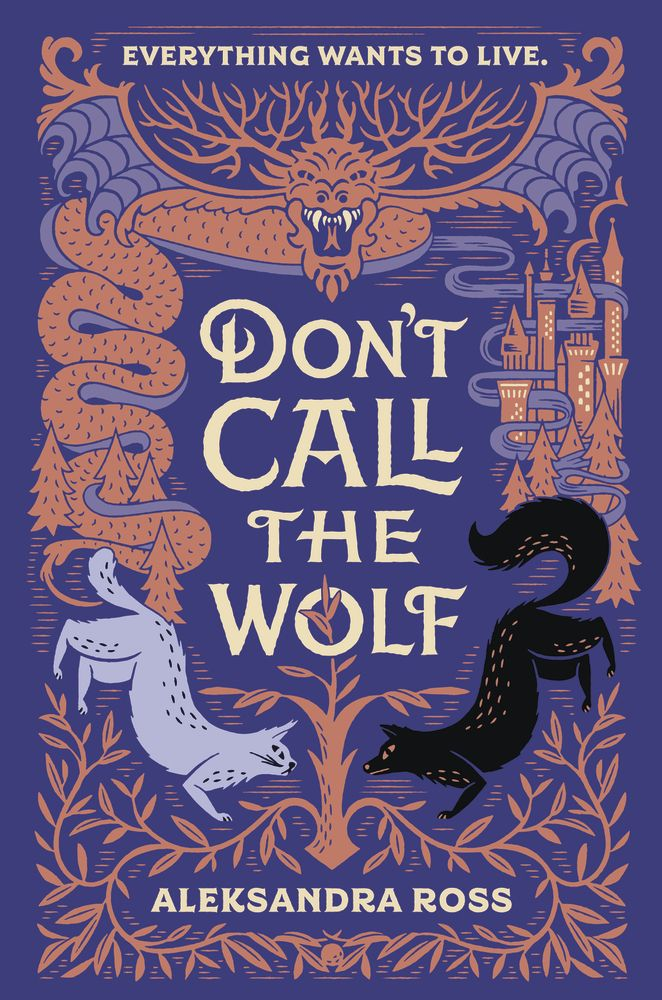
For a minute - forget everything you know about the fact that you’re creating stories. You are now creating a super stylish album / book cover that needs to stand out on a shelf.
PS: People do judge everything by the cover
Covers


Feeling inspired?
Great. Now step back. It's more complicated than that.
(but I'm glad you're inspired;)
- Avoid using complicated or custom illustration that can't be reproduced by the average user.
- Don't add any key messages as SVG / PNG - make everything editable via text elements
- Don't use more than 3-4 fonts in a template
- Templates needs to inspire users to build great things - but there will be repetition across kits (same assets presented differently).
- Use straight-from-Getty assets as much as possible - without that many edits
- Look DEEP into getty - people usually don't go beyond the 1st screen (you can use gettyimages.com and then put in the image ID)
- Always use real text and headlines - preferably not controversial (killings, disasters, trump, etc)
- Use a name generator for Authors : https://www.name-generator.org.uk/quick/
That's the covers part. Now to the content scenes...
- Cover all major content / layout types
- Cover everything from long text (no more than 2 paragraphs) to quick headlines (i.e. How so? How's that)
- Use one or multiple images / videos.
- Use nice clean text to borrow paragraphs- look into examples in the Google Sheets
- Don't use any photos from these sites!
- But do try to unnderstand the vibe... and why they work :)
- Stories need to have their own rhythm to keep users tapping - go from white to black and video to image... you get the point. That's why a good kit has everything.
Photos / Videos placement
Unless you're making a collage of photos / videos - always use FILL as background to avoid having white stripes on the sides
Fonts
Use sexxy, smart, cool fonts.
https://digitalsynopsis.com/design/best-font-combinations-typeface-pairings-guide/
https://www.pagecloud.com/blog/best-google-fonts-pairings

Thin fonts are nice - but bold is usually better. Not a general rule... you get the idea.


Colours
Come up with vibrant or soft combinations and use the consistently throughout your kit. I prefer a nice #f8f8f8 vs. #ffffff for example - look for such soft touches.
https://color.adobe.com/create
Like this.
Testing
Use device previews + browser bar to make sure your template looks great on all devices. Please remove text / lower font sizes if you see issues (i.e. on iphone5)
Consistency
Use your design concepts consistently throughout the kit. If you have more ideas - you can always apply them on the next kit.
Photo licensing
Don't forget to always license photos / videos
Examples
The existing 2 kits are good examples to look at - but I know we can do a lot better

Thank you!
Making a great tempalte
By mihaifanache
Making a great tempalte
Final


