Designing a great story template
(in 20 easy steps)
Cover Design
The covers will be the first entry point into the site & product.
New site will look like this, more or less:

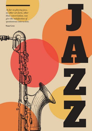
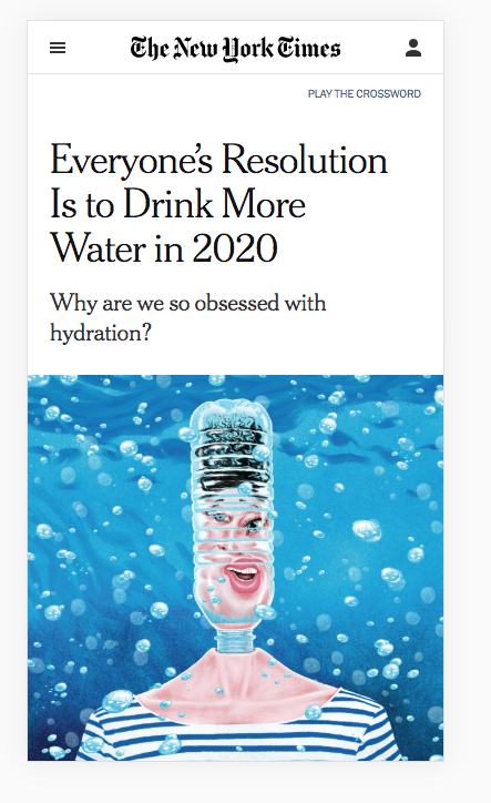
1. think film posters, album covers, book covers.
2. within the restrictions we have (3 text fields, 1 bg image or video)
3. pinterest is a good resource for eye candy


These covers I made are acceptable.


Start planning. Ready?
Pick your category:

+ Events
Education
Business
Finance
Movies
Start from a (good) photo
Start from a (good) headline
or


- Make sure your headline is not too long
- Give it a nice twist
- Make sure it's not an obscure topic
- Add a date + author name
- Try this name generator for authors
- Go look for images now

Started with a headline?

Started with a photo?
- Use a consistent colour palette within a kit
- Try Adobe Kuler for that.
- Export 720x1280px background
- Plan blank space for headline
- Use vibrant visuals, not dull, tired, stock-ish
- Avoid super-generic portraits (ie. white male working on laptop)
- Be careful with illustrations. They're very often overused / abused / fumate.
- Google a nice headline that describes your photo (ie. italian gelato guide guardian). Pick reputable sources
- Avoid alarmistic headlines
blank
Go for simple visuals, not disco balamuc.


Pick the vibrant character, not the generic man with generic laptop


Alternate text layout within a kit (up, middle, down)
Don't abuse overlay (but do use it every now and then)


Photo helps here - 0% overlay
Photo doesn't help so I used Overlay 20%
We don't want people to use our exact templates. We push them to think about what works and what doesn't and search for the right photo (even if it takes them hours...we're offering 3 billion photos from Getty.)
Overlay will always work but that's not how album covers are designed :)

Play with the 3 text fields. Middle can be headline. Or it could be the top one textfield.
Think coloured background.


Cover more angles of your theme (ie. travel) even if you're using similar looks:
Hotel review
World places
City review
Food
Activities
Pro tip: give your photos a 5% yellow colour effect in PS (or overlay in studio) and they'll look better together in a gallery.
So if you're covering sport, go:
2020 Olympics
Euro 2020
Tennis
Football
Cricket
Sport celebrities
...and their hot partners
Fans
Fitness
etc..
(don't get fixated on one thing only - galleries need to inspire)
We'll be offering search suggestions + sub-category suggestions.
Your sub-topics can become sub-category suggestions (ie. "travel activities")


Limit font usage to bold fonts. Let's leave skinny for later. Keep in mind template will show all on a page - so visual consistency is key.
Roboto
NWS F1
GT Walsheim
Curator
Futura
Hero
Rift
NWS Sans
...
Please use the same fonts and similar size combos / kit.
PS: Don't align right unless there's a very good reason.
Content Scenes
Create 12-18 content scenes / kit that cover all common content needs
Exemple:
clean text on white bg
same on coloured bg
img + small text
img + big text
video + text
quote
content recommendation
Use real text from various articles (don't lorem ipsum). Try fun, easy stuff - don't go academic.
Overlay is ok to use & abuse. But try to look for nice bright photos, still.
Please don't add any photoshopped call to actions in any designs.

UGH, how black :( Overlay abuse...

Much better :)
Save 3-4 scenes for quiz + poll + shoppable. De preferat care sa arate mai clever ca asta de jos.


How do save:

Name: just use the kit name - I don't think it's relevant.
Using the PS Clone tool

Need more clouds up here to make a nice 720x1280?

Use the clone stamp tool

Making more clouds...

Add some brightness in the end to hide imperfections
Thank you!
mihai
Designing a great story templatee
By mihaifanache
Designing a great story templatee
Final
- 781


